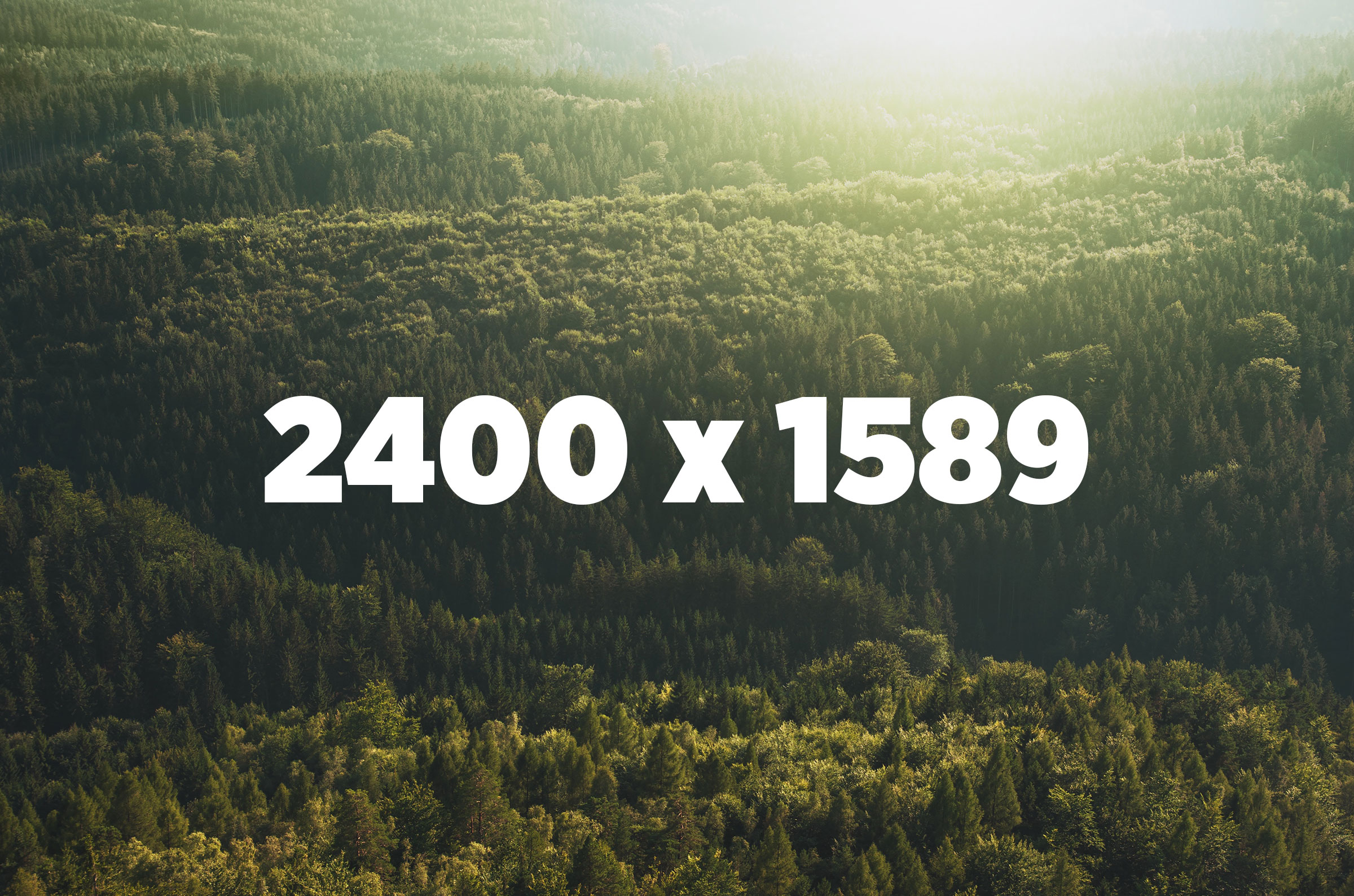
The example above demonstrates the responsive images technique used in the Laravel MediaLibrary.
Try this:
- Throttle your network in Chrome and disable the cache to see this in full effect
- Start with a small browser and reload this page
- Make your browser larger to start loading bigger versions
What happens?
-
We start with an image that has
srcsetvalues, rendered by the Laravel MediaLibrary -
An initial
sizes="1px"attribute is used to render an inline base64-encoded SVG placeholder first -
Once the page is loaded, JavaScript sets the
sizesto the actual width of the image in the layout -
Since we use a
vwvalue for this width, a bigger image will be loaded when you upscale the browser
